the shuga pie shop
PROJECT: THE SHUGA PIE SHOP
ROLE: UX / UI / VISUAL DESIGN
DURATION: 1 MONTH
the shuga
pie shop
PROJECT: THE SHUGA PIE SHOP
ROLE: UX / UI / VISUAL DESIGN
DURATION: 1 MONTH


TAP TO VIEW
prototype
TAP TO VIEW
prototype
.01
introduction
introduction
When they say the best places to experience food are hole-in-the-wall
When they say the best places to
When they say the best places to experience food are hole-in-the-wall spots, it rings true. In
spots, it rings true. In an alleyway in Babylon Village lives a tiny shop where
experience food are hole-in-the-wall
an alleyway in Babylon Village lives a tiny shop where you can pick up the most delicious
you can pick up the most delicious whoopie pies throughout all of Long Island.
spots, it rings true. In an alleyway in
whoopie pies throughout all of Long Island. Since I'm around corner, I can easily go there and
Since I'm around corner, I can easily go there and order in person. But what
Babylon Village lives a tiny shop where
order in person. But what about others? I noticed many challenges when trying to order
about others? I noticed many challenges when trying to order online.
you can pick up the most delicious whoopie
online. To better understand these challenges, I conducted interviews with friends, family,
To better understand these challenges, I conducted interviews with friends
pies throughout all of Long Island.
and locals who love the shop. This research revealed key pain points and laid the foundation
family, and locals who love the shop. This research revealed key pain points
Since I'm around corner, I can easily go
for a redesign. The interview questions included:
and laid the foundation for a redesign. The interview questions included:
there and order in person. But what
about others? I noticed many challenges
when trying to order online. To better
understand these challenges, I conducted
interviews with friends, family, and locals
who love the shop. This research revealed
key pain points and laid the foundation
for a redesign. The interview questions
included:
Do you visit the Shuga Pie Shop website?
Do you visit the Shuga Pie Shop website?
Do you visit the Shuga Pie Shop website?
Have you ever tried to order online
Have you ever tried to order online
Have you ever tried to order onlinevfrom the site? If not, why?
Have you ever tried to order online from the site? If not, why?
from the site? If not, why?
What challenges do you face when navigating the site?
What challenges do you face when
What challenges do you face when navigating the site?
navigating the site?
What features would you like to see added to the site?
What features would you like to see
What features would you like to see added to the site?
added to the site?
Are there areas where the text or images are hard to read or understand?
Are there areas where the text or
Are there areas where the text or images are hard to read or understand?
images are hard to read or understand?
images are hard to read or understand?
hypothesis statement
hypothesis statement
hypothesis statement:
User Personas:hypothesis statement
If the Shuga Pie Shop website adds a
If the Shuga Pie Shop website adds a direct
If the Shuga Pie Shop website adds a direct feature and clarifies essential details, the user
direct feature and clarifies essential
feature and clarifies essential details,
details, the user experience will improve
the user experience will improve
significantly.
significantly.
experience will improve significantly.
problem statement
problem statement
problem statement:
Users struggle to order pies from the
Users struggle to order pies from the
Users struggle to order pies from the Shuga Pie Shop website due to a lack of
Shuga Pie Shop website due to a lack of
Shuga Pie Shop website due to a lack of
information and an intuitive
information and an intuitive ordering
information and an intuitive ordering system.
ordering system.
system.
.02
insights &
statements
insights &
statements
insights & statements
Through these interviews I found insights into user behavior. To better
Through these interviews I found insights
Through these interviews I found insights into user behavior. To better organize the findings
into user behavior. To better
organize the finging and identify
organize the findings and identify
and identify actionable tasks, I created an affinity diagram. I categorized user feedback into
organize the findings and identify actionable tasks, I created an affinity
actionable tasks, I created an affinity
four key areas for improvement: navigation, information, design, and user experience.
diagram. I categorized user feedback into four key areas for improvement:
diagram. I categorized user feedback into
four key areas for improvement:
navigation, information, design, and user experience.
navigation, information, design, and user
experience.
With a clear understanding of the user's needs, I formulated the
With a clear understanding of the user's
With a clear understanding of the user's needs, I formulated the problem and hypothesis.
problem and hypothesis.
needs, I formulated the problem and
hypothesis.
TAP TO VIEW
user flow
diagram / IA
TAP TO VIEW
user flow
diagram / IA


.03
.03
.03
design strat
design strat
with the insights gathered form the interview and affinity maps, i began
With the insights gathered from the
With the insights gathered from the interview and affinity maps, I began
With the insights gathered from the interview and affinity maps, I began sketching initial
sketching initial wireframes to visualize the solutions. My design approach
interview and affinity maps, I began
was centered around enhancing user experience by simplifying navigation,
sketching initial wireframes to visualize
wireframes to visualize the solutions. My design approach was centered around enhancing
centered around enhancing user
centered around enhancing user
online ordering system.
improving access to information, and adding an online ordering system.
the solutions. My design approach was
user experience by simplifying navigation, improving access to information, and adding an
experience by simplifying navigation,
improving access to information, and
adding an online ordering system.
User Personas:
Based on interview data, I created user personas to represent different
Based on interview data, I created user
Based on interview data, I created user personas to represent different customer segments,
customer segments, making sure the design addressed the needs of all
personas to represent different customer
making sure the design addressed the needs of all Shuga Pie Shop users.
addressed the needs of all Shuga Pie Shop
Shuga Pie Shop users.
segments, making sure the design
users.
Sketching & wireframing
Sketching & wireframing
I sketched layout ideas to enhance key features, which served as the
I sketched layout ideas to enhance key
I sketched layout ideas to enhance key features, which served as the blueprint for digital
for digital wireframes.
blueprint for digital wireframes.
features, which served as the blueprint
wireframes.


←
→
←
→

.04
.04
.04
structuring the journey
structuring
the journey
structuring the journey
With the insights from user interviews and affinity mapping, the next step was to refine the user experience. I
With the insights from user interviews
With the insights from user interviews and affinity mapping, the next step was to refine the
focused on structuring the
and affinity mapping, the next step was to
focused on structuring the journey, ensuring that each interaction was purposeful and intuitive.
user experience. I focused on structuring the website's journey, ensuring that each
journey, ensuring that each interaction was purposeful and intuitive.
refine the user experience. I focused on
interaction was purposeful and intuitive.
structuring the website's journey,
ensuring that each interaction was
purposeful and intuitive.
User Flow & Information Architecture:
User Flow & Information Architecture:
User Flow & Information Architecture: To map out the user's journey, I created a user flow
To map out the user's journey, I created a user flow diagram that outlined the steps from product exploration to
To map out the user's journey, I created a
diagram that outlined the steps from product exploration to purchase. This visualization
purchase. This visualization helped refine the navigation paths, ensuring an intuitive and efficient experience
user flow diagram that outlined the steps
helped refine the navigation paths, ensuring an intuitive and efficient experience for users.
for users. The information architecture was then structured to provide clear pathways to essential information,
from product exploration to purchase.
The information architecture was then structured to provide clear pathways to essential
navigation paths, ensuring an intuitive and
making navigation seamless.
This visualization helped refine the
information, making navigation seamless.
efficient experience for users. The
information architecture was then
structured to provide clear pathways to
essential information, making navigation
seamless.


←
→
←
→
TAP TO VIEW
affinity map
TAP TO VIEW
affinity map

.05
.05
visual structure
visual
structure
visual structure
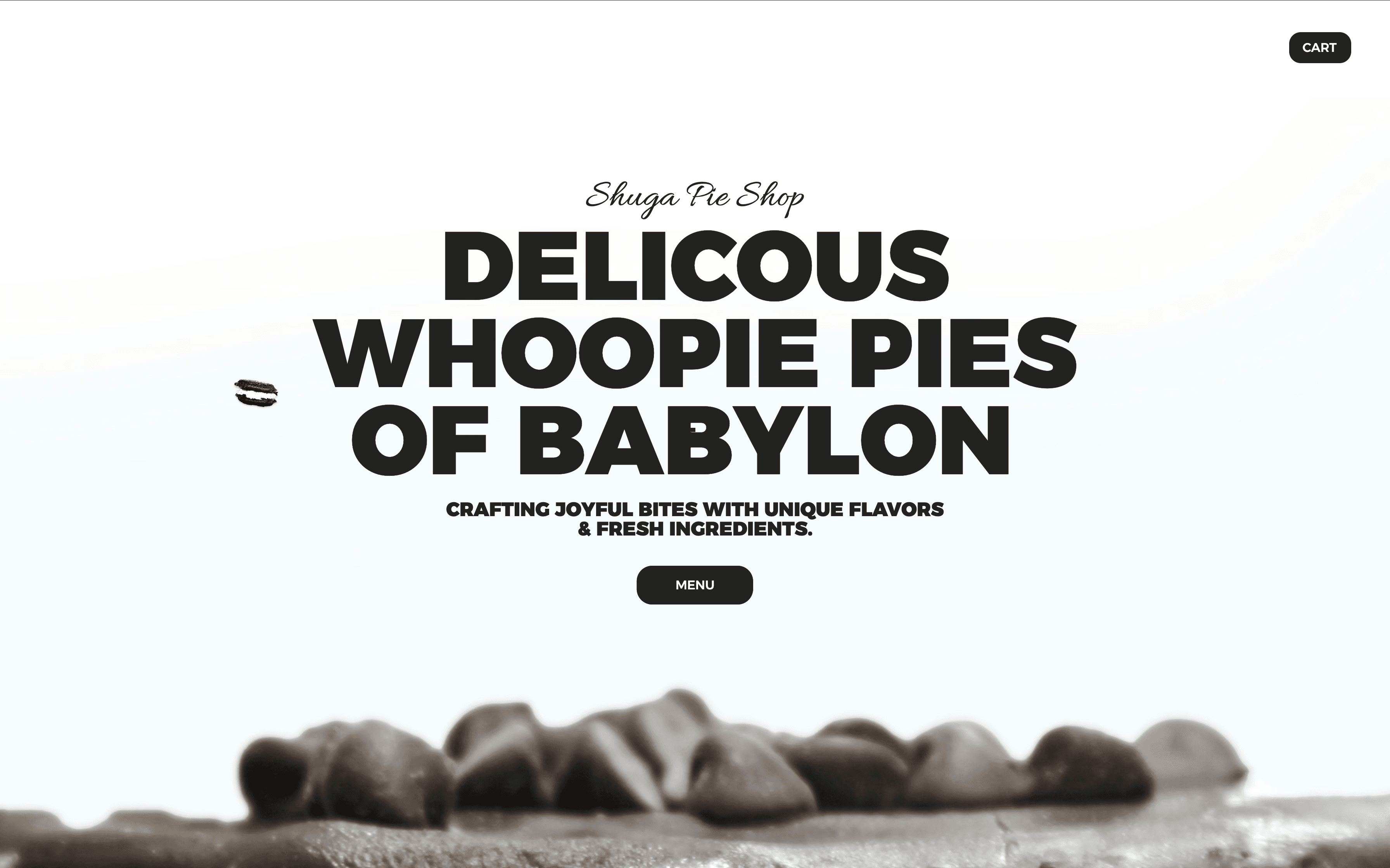
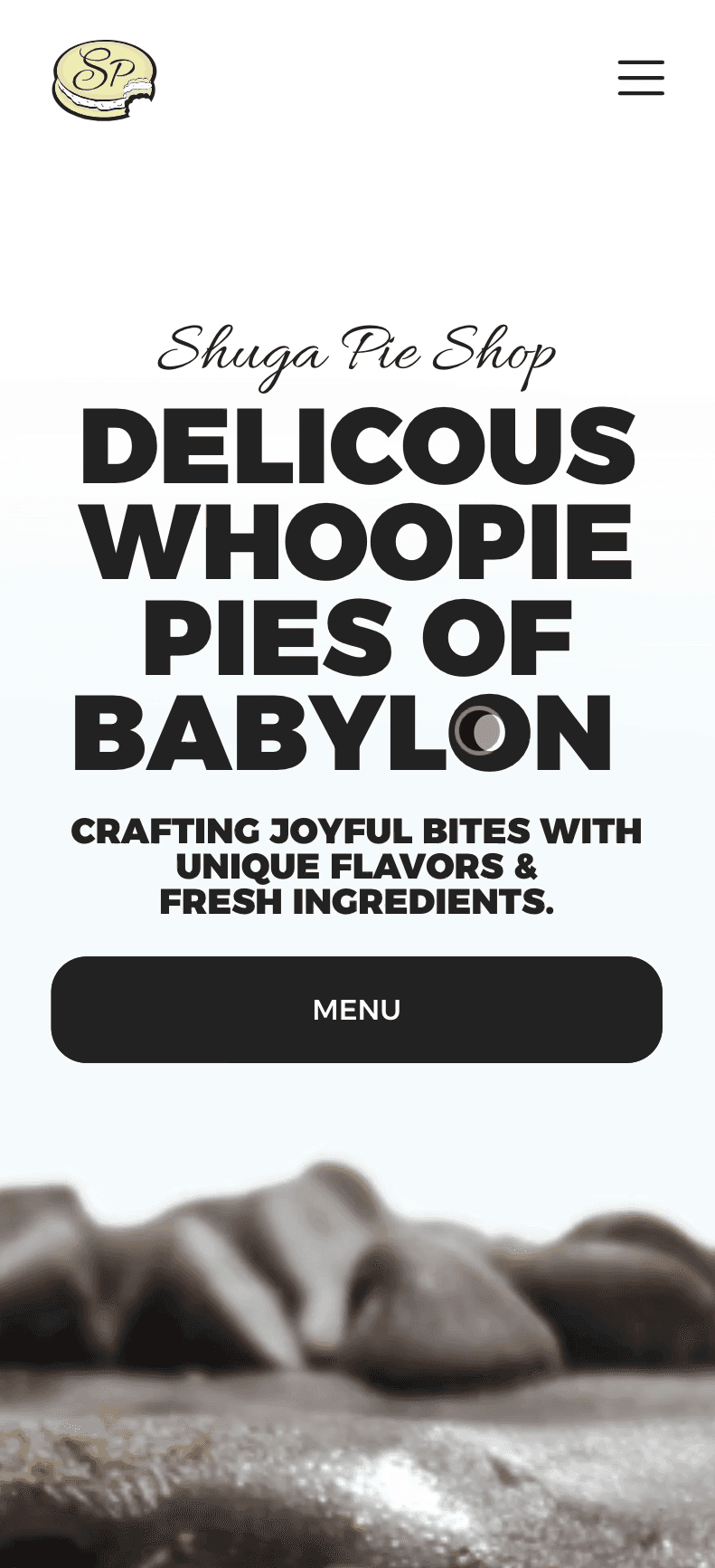
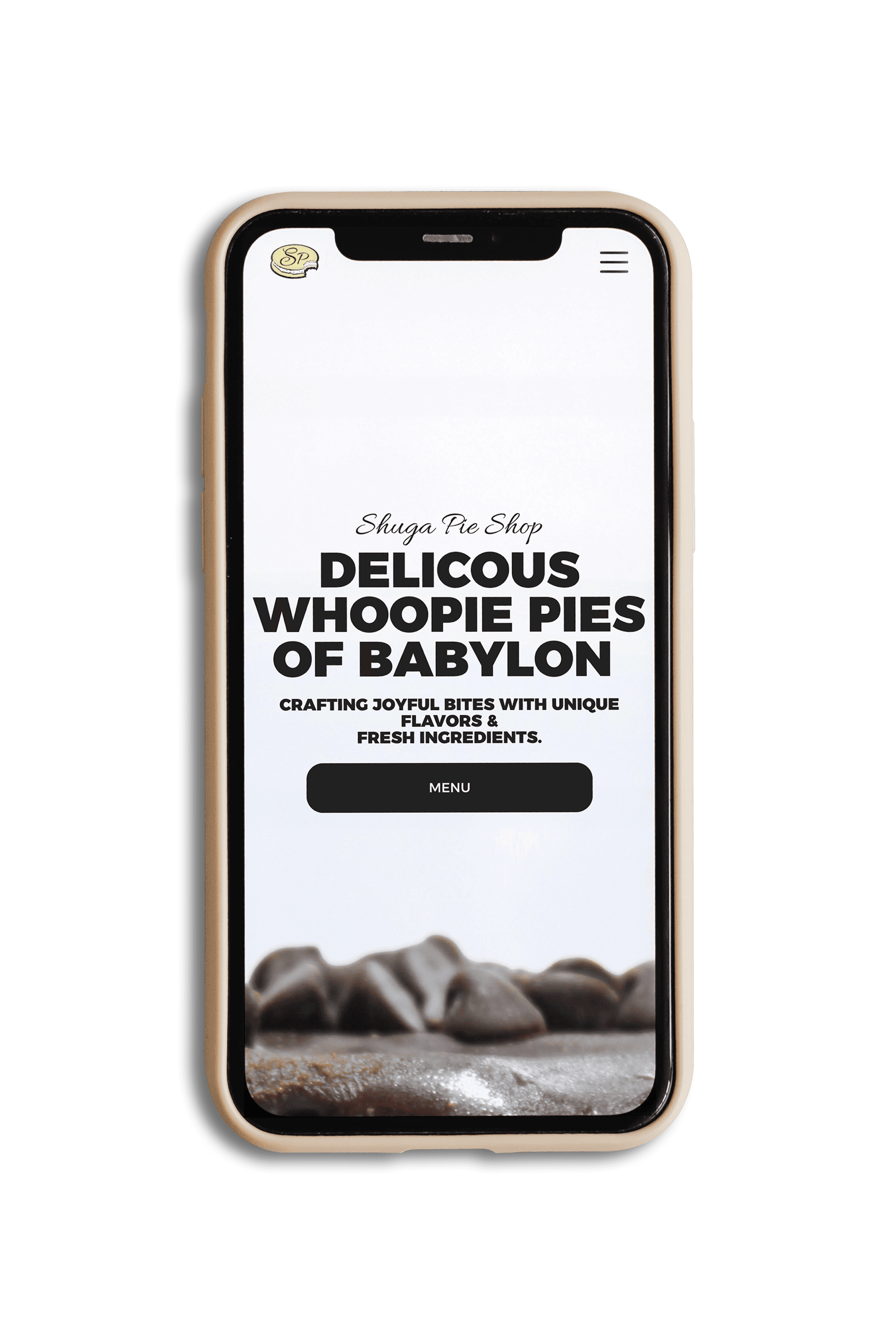
The Shuga Pie Shop’s visual identity was crafted to reflect it's community. I used 'Alexandria Black'
The Shuga Pie Shop’s visual identity was
The Shuga Pie Shop’s visual identity was crafted to reflect its community. I used
for bold headers and 'Work Sans' for clear readable body text. The charcoal and white color palette
crafted to reflect it's community.
'Alexandria Black' for bold headers and 'Work Sans' for clear readable body text. The
for bold headers and 'Work Sans' for
for bold headers and 'Work Sans' for
touchpoints.
creates a consistent, clean, inviting experience across all touchpoints.
I used 'Alexandria Black'
charcoal and white color palette creates a consistent, clean, inviting experience across all
clear readable body text. The charcoal
and white color palette creates a
across all touchpoints.
consistent, clean, inviting experience
TAP TO VIEW
user personas
TAP TO VIEW
user personas

TAP TO VIEW
style guide
TAP TO VIEW
style guide